
My Role
Product Designer
Responsabilities
Discovery, Research, Usability test, UI Design
Team+
Tech Lead, PM, 2 Dev Front
Timeline
1 month
This project involved redesigning the post-sale experience for Voltz's E-Commerce platform.
We aimed to increase company revenue by reducing the cancellation of paid orders and understanding what led users to cancel. The challenge was to reduce user anxiety, build brand trust, and improve the overall "waiting" experience.
How Orders Work at Voltz E-Commerce
Currently, Voltz customers purchase a reservation on our e-commerce site. Due to high customer demand, the sales team only contacts the customer to complete the payment after 24 weeks. Production of the customer's motorcycle starts after payment, with delivery occurring a few weeks later. This process functions like a waiting line.
However, some users were choosing to cancel even after completing the payment.

By revisiting our cancellation flow, we identified friction points compared to our competitors. We conducted a competitive analysis to understand how competitors and other brands handle the cancellation process.
These friction points affected the experiences of clients who had already requested solutions as well as those who hadn't. After analyzing competitors and comparing their processes with ours, we proposed changes to the cancellation process.
The goal is to deliver a fluid and intuitive journey for the user to retain them by offering solutions to their problems.

Splitting the discovery
To understand users' pain points while visiting the order page, we set up a survey using Hotjar. We clustered the feedback and identified a problem that led us to split our strategy. Users had many questions that, if answered, could prevent cancellations. We needed users to find the login area easily to manage their experience.
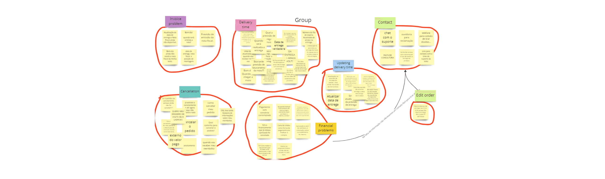
Key research takeaways
After interviewing users in the cancellation process and analyzing the data, we identified three opportunities to improve retention and reduce cancellations.

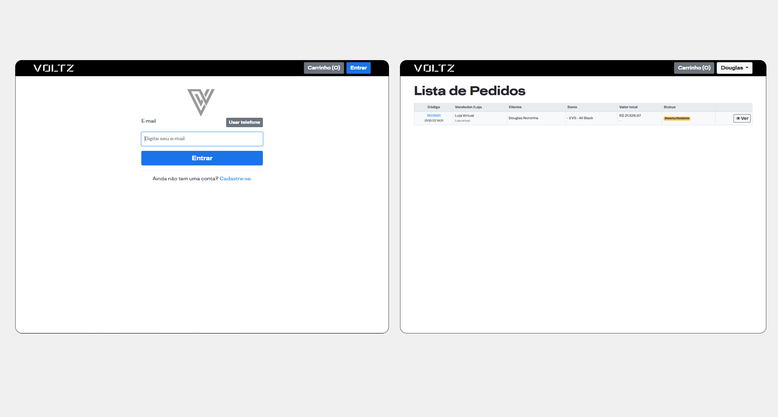
Current experience
The only way for users to track their order is by signing into the customer area. Due to friction points in the user journey, users often submit support tickets on Zendesk. If not satisfied, they may request a cancellation.
The starting point of this journey is problematic because the button label is "BUY."
Who should click on "BUY"? Users who want to purchase a bike. While not an incorrect label, it was the only option available for all types of users.

We had the opportunity to provide a more fluid and intuitive navigation experience, reducing friction and offering more information about their motorcycle.
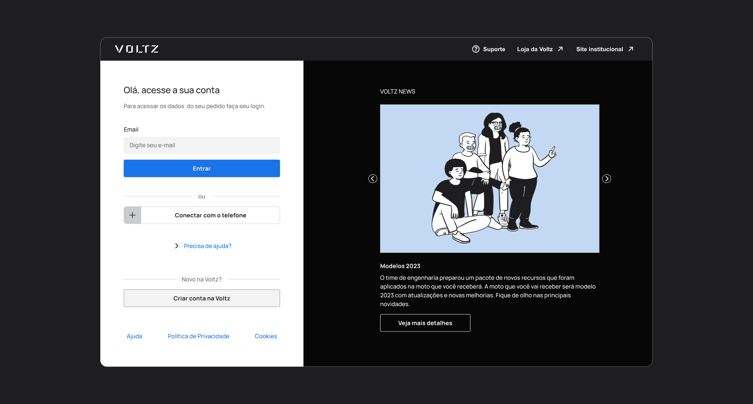
Quick win solution
We proposed creating a secondary button on the homepage to redirect users who have already purchased a motorcycle, improving the starting point of their journey.

Creating a new track experience


Creating a new track experience
By clicking on 'Problemas com o pedido' (Problems with the Order), users can access a list of common issues they may face and how to resolve them.
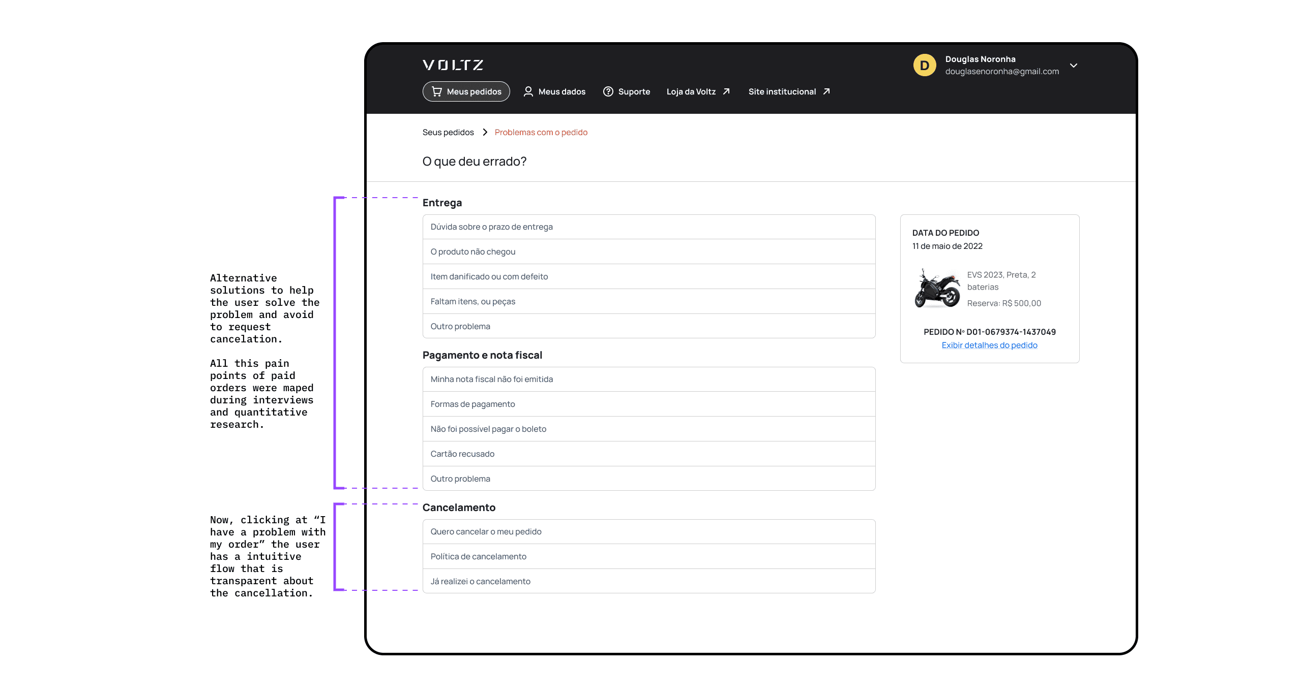
After implementing the proposed changes and integrating the cancellation process into the login area, we conducted usability tests to evaluate the effectiveness of the new solution. The tests showed positive results, confirming that the integration improved user navigation and reduced friction in the cancellation process.
