My Role
Product Designer
Responsabilities
High fidelity templates, new layout composition, design core principles
Team+
Dev front
Timeline
2 months
CONTEXT / SCOPE
Musa's initial design system faced significant issues with inconsistency and inefficiency. The lack of clear guidelines and a unified token system led to visual and functional unreliability, causing poor readability and inadequate user feedback.
Our fragmented approach resulted in a user experience that struggled with visual hierarchy and color differentiation. Recognizing these challenges, we developed MAE DS to streamline design and development, creating a cohesive and efficient product experience. Below is an image of our application before implementing MAE DS, highlighting key areas needing improvement.

Misapplication of Brand Colors and Lack of Standards
The legacy design system exhibited several critical flaws. Brand colors were improperly used for status indicators instead of reserved negative colors, leading to confusion and reduced effectiveness in conveying feedback. The absence of a standardized approach resulted in inconsistent application across various components, undermining both usability and visual coherence.
Additionally, the system failed to align with industry standards, lacking the necessary structure and guidelines to ensure a seamless user experience. The following image illustrates these issues, showcasing how the old components did not meet market expectations and compromised overall design integrity.


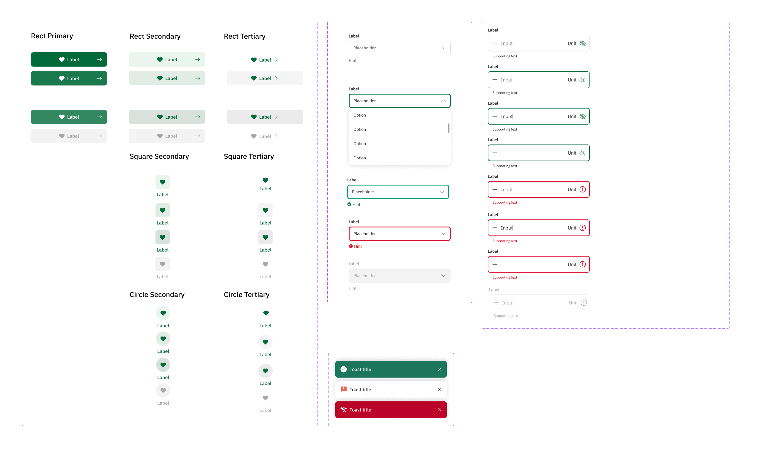
Token System Development: Borders, Backgrounds, and Content
In constructing the MAE DS design system, we meticulously developed tokens categorized into Borders, Backgrounds, and Content. This structured approach provided a clear framework for consistent design implementation.
Borders tokens define the visual boundaries and separation between elements, ensuring clarity and emphasis in component layouts. Backgrounds tokens set the foundational surfaces for content, offering a uniform backdrop that enhances readability and visual hierarchy. Content tokens, including text and icons, ensure that primary information is easily accessible and consistently styled across all interfaces.
Collaborating closely with the development team, these tokens guided the creation and integration of components, fostering a coherent design language that aligns with both design principles and technical feasibility. This collaborative effort streamlined the development process and ensured that the design system meets both aesthetic and functional standards.